Shakespeare's Globe guidelines repositioning
In my years as Creative director and Design manager for the Shakespeare's Globe, I faced the necessity to reposition the Shakespeare’s Globe branding.This is how I channeled some of the issues I encountred.
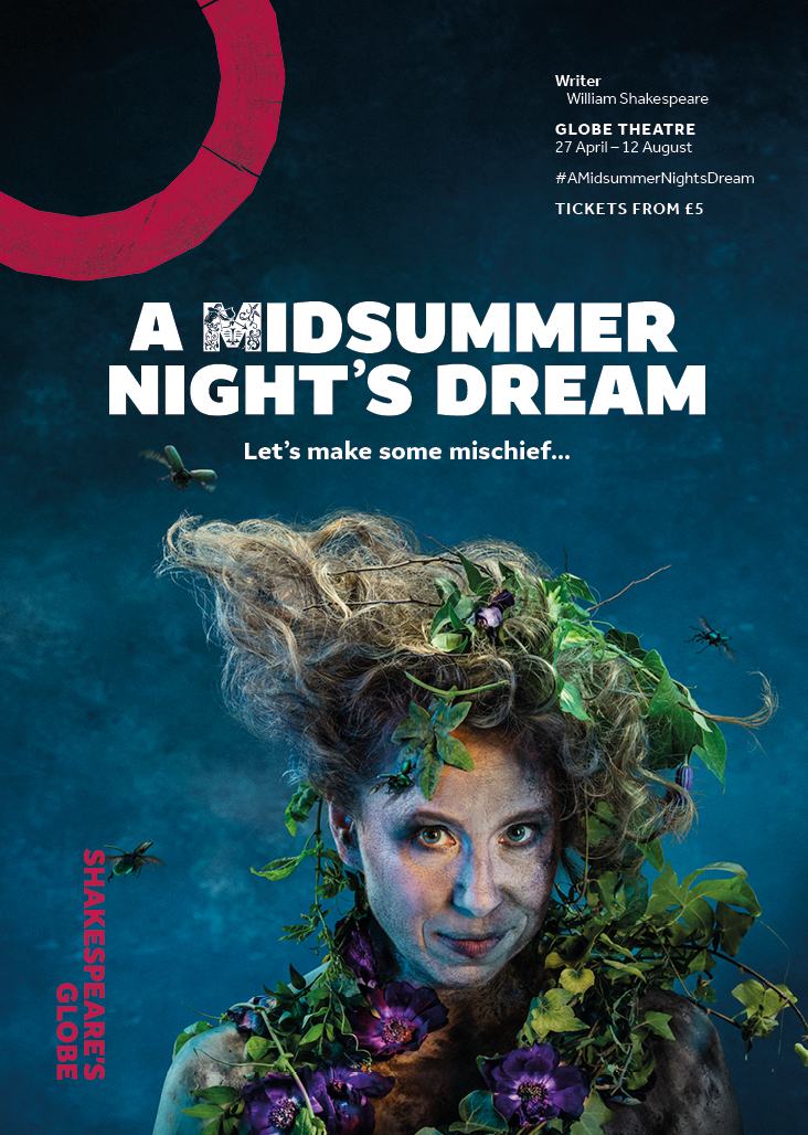
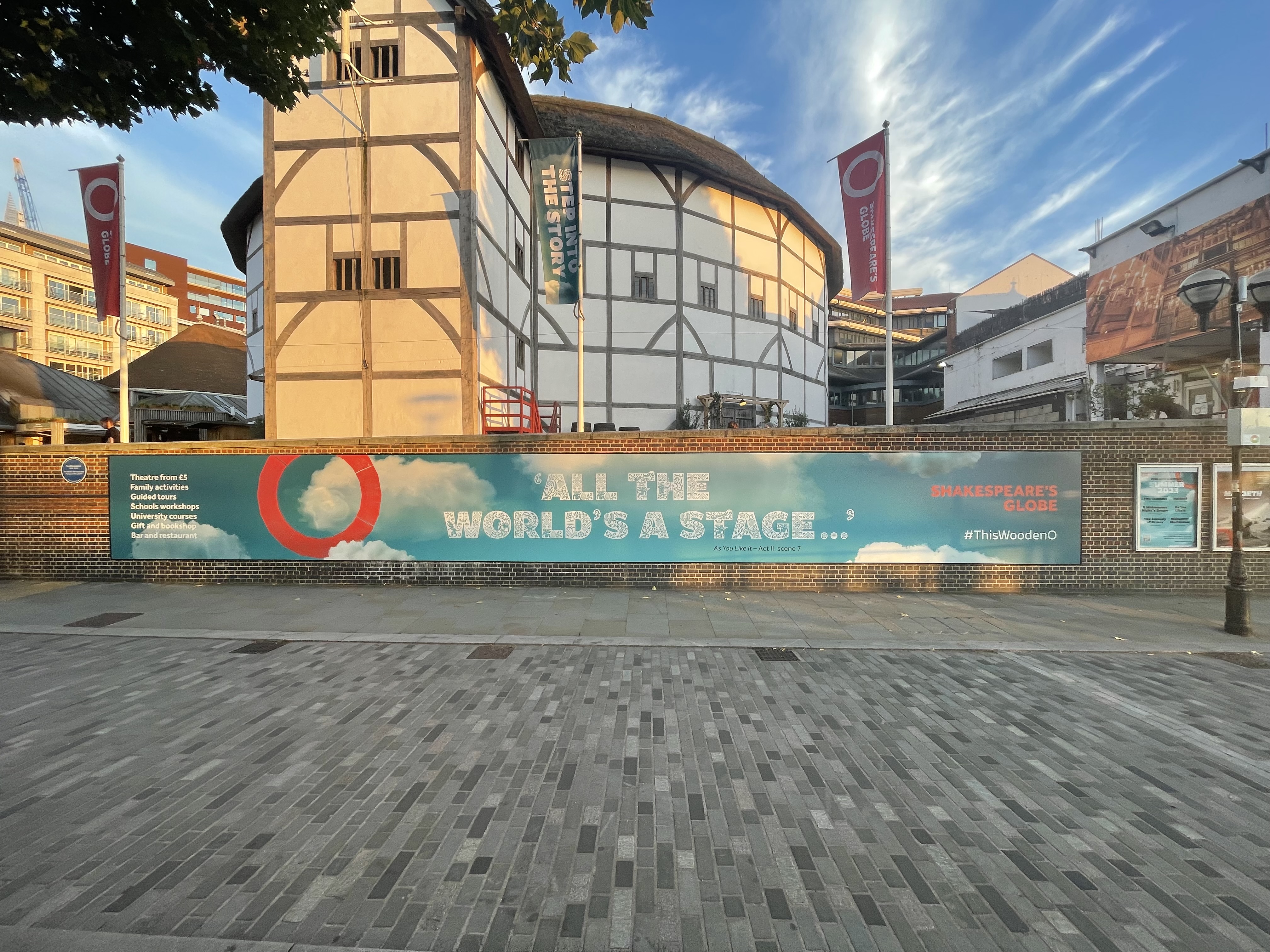
Colours: The initial challenge surfaced with the need to infuse a broader spectrum of colors into our imagery. Previous guidelines constrained the theatre to a palette of black, red, and white, potentially jeopardizing Shakespeare's Globe's marketing prominence amidst London's diverse theatre landscape.
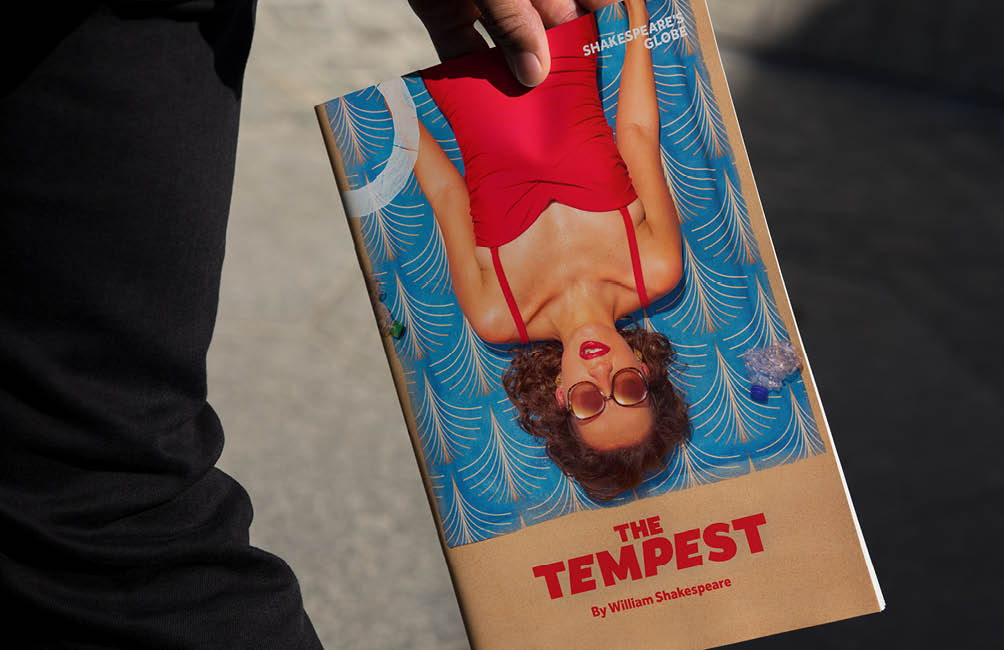
Typography: Expanding the images colour palette prompted a deliberate shift towards consolidating typeface choices... we went to a limitless number to two. Opting for the bold and versatile Amifer, I've developed a consistent yet playful approach over the years, leveraging its adaptability to craft a cohesive brand identity. When selecting typefaces, I often prioritize those with high legibility for print and explore their potential for digital purposes as well.

Amifer Folio︎: born out of the necessity to celebrate the 400 years of the First Folio. Initially developed to support the season’s bold photography in Amifer, it soon became evident that it had great potential over time and became part of the organization’s official documents.

Illustrations: Illustrations evolved into a versatile system that resonated with both our younger audience︎ and our higher education programs︎ alike, ensuring accessibility across diverse demographics.

Digital Presence and logo usage: Embracing a "digital-first" strategy, I repositioned our logotype, comprising both a mark and logotype. By adopting a more unified approach to their usage, the organisation achieved a heightened visual dominance in our imagery while ensuring consistent application of our logo across platform.

Animation within digital presence: Developing a robust online presence prompted me to reconsider posters not merely as static elements but as extensions of a theatrical performance. Animation was incorporated into both photographic posters as well as animations.

Grids: An 8-column grid system was replaced by a 12-column system, and adjustments were made to all documents, while retaining the idea of playing with the structure of the First Folio — the most important Shakespeare publication — initially developed by The Partners.